At Cicerone we never get tired of making sure we offer the best way to show Granada to all those who want to experience it. Whether you’re a visitor or a local, anyone who wants to explore the prettiest corners of the Albayzín, or get to know some very curious tales about Realejo and the historic centre, at Cicerone, you will find the guide to Granada that you’ve been looking for.
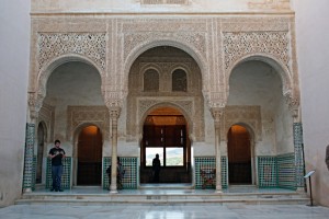
That is why we always aim for offering visitors the best, we are renewing our image, logo and the headers on both our blog and our website. For the designers at RSC Estudio, the starting point of our new brand image are the mosaics in the Patio del Cuarto Dorado de la Alhambra. The beauty of the tiles ensured that visitors approached the Mexuar Palace to plead for justice to the emir of Granada were left enraptured by the perfection of their geometry and colours.
As do the thousands of people who visit the Nasrid Palaces every day, and those mosaics inspired our designers to create a basic pattern with the idea that the tiles would be a great way to “welcome” all of the visitors to the Alhambra.
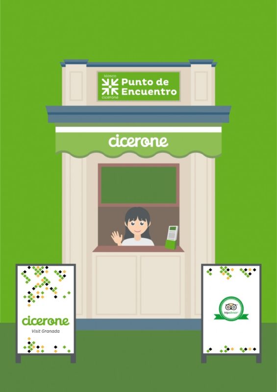
According to RSC Estudio, our restyling creates a lively brand that can feature different employers without losing its own personal touch.
From just a basic pattern we can create a lively brand whose appearance can change without losing its identity. We can create static versions where the mosaic is more recognisable, which contributes a certain balance and forcefulness, or more dynamic version where we use fragments of mosaic with a more casual and cheerful feel.


